Choosing the right paint color can transform a space, creating an environment that reflects personality and style. In the world of interior design, color harmony is key to achieving a cohesive and aesthetically pleasing look. Understanding how to select the perfect paint color involves more than just picking a favorite shade; it requires an understanding of color theory, lighting, and the existing elements within a space. Here are some expert tips to guide you in creating the perfect color harmony in your home.
Understanding Color Theory
Color theory is the foundation of selecting harmonious colors. It involves understanding the color wheel, which is divided into primary, secondary, and tertiary colors. Primary colors are red, blue, and yellow, while secondary colors are created by mixing two primary colors. Tertiary colors result from mixing a primary and a secondary color. Complementary colors, which are opposite each other on the color wheel, create a vibrant look when used together. Analogous colors, which are next to each other on the wheel, offer a more serene and comfortable design. By understanding these relationships, you can select colors that work well together and create the desired mood in your space.
Considering Lighting Conditions
Lighting plays a crucial role in how paint colors appear in a room. Natural light, artificial light, and even the direction a room faces can alter the perception of color. A north-facing room may make colors appear cooler, while a south-facing room can enhance warm tones. It's important to test paint samples in different lighting conditions throughout the day to see how they change. This will help you choose a color that maintains its appeal regardless of the time of day or type of lighting.
Matching with Existing Elements
When selecting paint colors, consider the existing elements in the room, such as furniture, flooring, and fixtures. These elements can guide your color choices, ensuring that the new paint complements rather than clashes with what is already present. For instance, if you have a bold piece of furniture, you might opt for a more neutral wall color to balance the space. Alternatively, you can use the colors in a favorite piece of artwork as inspiration for your paint palette.
Using Neutrals Effectively
Neutrals are versatile and can serve as a foundation for any color scheme. They provide a backdrop that allows other colors to stand out. When using neutrals, consider the undertones, which can be warm or cool. A warm neutral, like beige, can create a cozy atmosphere, while a cool neutral, like gray, can offer a modern and sleek look. Neutrals can also be layered to add depth and interest to a room without overwhelming it.
Creating a Focal Point
A focal point draws attention and can be created using paint. This could be an accent wall in a bold color or a painted ceiling that adds an unexpected element to the room. When creating a focal point, choose a color that contrasts with the rest of the space to ensure it stands out. This technique can highlight architectural features or create a visual anchor in a room.
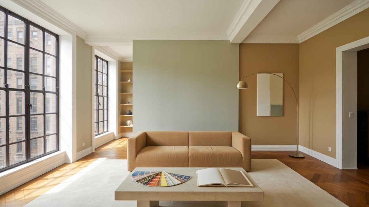
Testing Paint Samples
Before committing to a paint color, it's wise to test samples on your walls. Paint small sections in different areas of the room to see how the color interacts with light and other elements. This step can prevent costly mistakes and ensure you’re satisfied with the final result. Testing samples also allows you to experiment with different finishes, such as matte, satin, or gloss, to see which best suits your space.
Considering the Room's Purpose
The function of a room can influence color choices. For example, calming colors like blues and greens are often used in bedrooms to promote relaxation, while vibrant colors like reds and yellows can energize a kitchen or dining area. Consider how you want to feel in the space and choose colors that align with that mood. This approach ensures that the color not only looks good but also enhances the room's purpose.
Balancing Bold and Subtle Colors
Achieving color harmony often involves balancing bold and subtle colors. A bold color can add personality and drama, but too much can overwhelm a space. Pairing bold colors with more subdued tones can create a balanced and harmonious look. For instance, if you choose a bold color for the walls, consider using neutral or softer colors for furniture and accessories to maintain balance.
Incorporating Trends Wisely
While it's tempting to follow current color trends, it's important to choose colors that you will enjoy long-term. Trends can provide inspiration, but they shouldn't dictate your choices. Consider incorporating trendy colors in small doses, such as through accessories or accent walls, rather than committing to a full room in a trendy shade. This approach allows you to update your space easily as trends change.
Seeking Professional Advice
If you're unsure about selecting the right paint colors, consulting with a professional can provide valuable insights. Interior designers have expertise in color theory and can offer personalized advice based on your space and preferences. They can help you navigate the vast array of color options and create a cohesive look that reflects your style. A professional can also introduce you to new ideas and combinations you might not have considered, ensuring a result that is both unique and harmonious.
Transform Your Space with the Right Colors
Choosing the right paint colors can truly transform your home, creating a space that feels both inviting and harmonious. By understanding color harmony and using expert tips, you can make confident decisions that reflect your personal style. Remember, the perfect paint can enhance your living environment and even boost your mood. If you're ready to start your color journey, reach out to Laura Farr for personalized advice and guidance.